COLOUR SCHEME
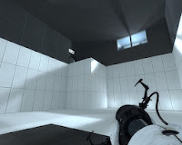 My inspiration for the colour scheme stems from my past experience playing games from the Portal franchise. The game's take place within a factory, no humans are present in the game except for the main characters. What really intrigued me about the game was the futuristic. white wash-over that appeared throughout the game in both the levels and characters.
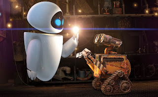
I felt like the white gloss gave the game a real futuristic, robotic look. Sort of like how EVA appears in contrast to WALL-E in Disney's WALL-E.
In this movie, EVA is a depiction of futuristic (for modern times), advanced technology, and is white.
I had considered other options for colour schemes, but ultimately I found that metallic colours such as white, grey and black helped mimic the feel of a factory. Coming from an Art background I can appreciate the effect and connotations that come with using certain colours. It was my intention to leave out anything that would represent an organism, with the exception of the eyes, which were intentional.
POKEMON
During the initial stages of design I was thinking critically about my characters and the various forms they would take. Being a Pokemon player I was well aware that in their Pokemon designs they had explored all forms of creatures. I thought back upon some of my favourite from Gen 3 and thought about the Pokemon Metagross:
Metagross is essentially the alpha design of Legs. The things I took note of were the legs, as they are a key feature for Metagross. Similarly, the feature of Legs' design are indeed, his legs. Instead of a quadruped I adapted Legs to be a biped as I wanted a large eye to feature in the centre of his body. I also anticipated that four legs would be much more work than one in terms of animation.
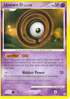
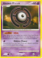 Float is also inspired by a Pokemon; the Unknown Pokemon is unique as it has 26 different forms, corresponding with an alphabet:
 The Unknown which represent the letters 'H' and 'O' are two which I considered when designing Float. While all of the Unknown float, 'H' and 'O' are the only two with rings around them ( H's ring is broken).
ANATOMY
 From the beginning I had planned on implementing realistic biped animations for my characters. In doing so I had to design them with a biped structure in mind. One of the more complex aspects involved joints. In the case of Bub, I knew that he would have elbows and knees, so I looked into the kind of angles and extensions that could realistically be achieved, to avoid any overlapping meshes or clipping during animation.
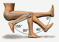 I found a diagram which perfectly demonstrates the limits with which an elbow joint can operate. Using it as a guideline, I designed the upper and lower arm to fit together when fully extended, and made the elbow joint long enough so that flexion and extension could occur without any overlap.
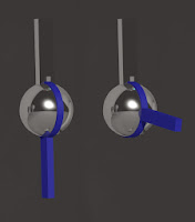 I decided that the easiest way to do this was to use a sphere as the ball of the elbow, ankle and knee. I actually made one mechanism and re-scaled it for multiple purposes.
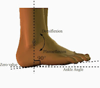
Using my newly acquired knowledge I made a joint which allowed for an extension of 180°, an angle which would satisfy the 140° required for the elbow, 155° for the knee and 90° for the ankle.
EYES
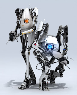 The concept of an 'eye-bot' as such has been done before on a number of occasions. In the Fallout game franchise, there are robots known as Eye-Bots that acts as camera drones and are floating spheres or 'eyes'. In Portal 2, two notable 'eye-bots' (shown left) are featured in the game's co-op mode. These characters are known as Atlas (right) and P-Body (left). These characters bear similarities to mine, in that they feature eyes in the centre of their head, and have both arms and legs.
While these characters definitely played a part in the design of my characters, I did not use them as a reference point. I think subconsciously I had these characters in the back of my mind, and they did serve to point me in a direction of how I would progress my characters, perhaps even the concept of a humanoid eye-bot.
STAR WARS
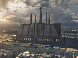 The concept of a factory scene is rooted solely in this image (right). It is an image of the Jedi Temple on Coruscant. This image is from the Star Wars universe. As a huge fan I was looking to implement Star Wars in my project somewhere, this building sparked an idea for a factory design with which the animation would take place. It was intended that I would model a city-scape similar to this and implement an exit scene, but due to time constraints the idea was scrapped.
 |
| Droid Factory on Geonosis |
ESCAPE
The concept of an escape stems from my experience with the Playstation game Abe's Odyssey. In this game, the protagonist (Abe) seeks to purge his fellow workers from an overlord who aims to enslave Abe's friends and eventually species. The game (initially) takes place in a factory and is centred around the rescue of Abe's friends. I have taken elements from both the plot and environment of this game and implemented them in to my animation. Bub takes on the role of Abe as the one who can see the problem and acts as the catalyst to an escape.
Note: Coincidentally, I found out while researching that the sequel to this game is titled 'Abe's Exoddus'.
AWAKENING
 The opening gameplay scene in Fallout 3 involves opening the players eyes as a newborn baby. In this scene, a heartbeat is played loudly and to great dramatic effect. Although the scene itself is not overly complex, the sound effects and blurred camera made for an effective and convincing scene. I tried to imitate this effect in my animation, using the dark container as a go-to for an awakening.


No comments:
Post a Comment