Project: Exodus can be found here:
Project: Exodus
Monday, 25 November 2013
Sunday, 3 November 2013
The Beginning
Situation: "GraphicX" specialize in graphical solutions to the gaming industry. The team has been approached by BioWare game publishers to produce a quality cinematic trailer leading up to the much-anticipated release of their new game ‘PROJECT: EXODUS’.
This game follows the story of three robot protagonists code-named: Bub, Legs and Float on their journey to escape a large factory complex run by an artificial intelligence overlord known as the Bio-mechanical Overlord Security System or B.O.S.S., who employs drones known as Igors to do it's 'hands-on' work of disciplinary action.
The game's director notes: We are after a cinematic trailer that appeals to the rumors circulating about the release of this game. We need something short, fast and precise that conveys our current ideas and gives no indication that we are still in the design process of our game. We are currently yet to decide on a physical form for the B.O.S.S so feel free to leave it's presence ambiguous, this will allow for further publicity of our game if the highly anticipated nemesis remains a mystery. What we really want is for our fans to fall in love with our characters, specifically Bub, as we feel he will play a leadership role in further developments.
In the short term, we want an enticing cinematic that will both engage and excite our viewers and whet their appetites for the exciting revolution we have in store for our generation of gamers.
Design Brief:
Produce a feature-length trailer for an up-coming game release.
Research
COLOUR SCHEME
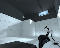 My inspiration for the colour scheme stems from my past experience playing games from the Portal franchise. The game's take place within a factory, no humans are present in the game except for the main characters. What really intrigued me about the game was the futuristic. white wash-over that appeared throughout the game in both the levels and characters.
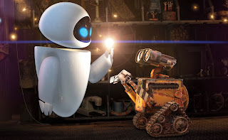
I felt like the white gloss gave the game a real futuristic, robotic look. Sort of like how EVA appears in contrast to WALL-E in Disney's WALL-E.
In this movie, EVA is a depiction of futuristic (for modern times), advanced technology, and is white.
I had considered other options for colour schemes, but ultimately I found that metallic colours such as white, grey and black helped mimic the feel of a factory. Coming from an Art background I can appreciate the effect and connotations that come with using certain colours. It was my intention to leave out anything that would represent an organism, with the exception of the eyes, which were intentional.
POKEMON
During the initial stages of design I was thinking critically about my characters and the various forms they would take. Being a Pokemon player I was well aware that in their Pokemon designs they had explored all forms of creatures. I thought back upon some of my favourite from Gen 3 and thought about the Pokemon Metagross:
Metagross is essentially the alpha design of Legs. The things I took note of were the legs, as they are a key feature for Metagross. Similarly, the feature of Legs' design are indeed, his legs. Instead of a quadruped I adapted Legs to be a biped as I wanted a large eye to feature in the centre of his body. I also anticipated that four legs would be much more work than one in terms of animation.
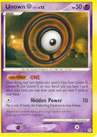
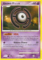 Float is also inspired by a Pokemon; the Unknown Pokemon is unique as it has 26 different forms, corresponding with an alphabet:
 The Unknown which represent the letters 'H' and 'O' are two which I considered when designing Float. While all of the Unknown float, 'H' and 'O' are the only two with rings around them ( H's ring is broken).
ANATOMY
 From the beginning I had planned on implementing realistic biped animations for my characters. In doing so I had to design them with a biped structure in mind. One of the more complex aspects involved joints. In the case of Bub, I knew that he would have elbows and knees, so I looked into the kind of angles and extensions that could realistically be achieved, to avoid any overlapping meshes or clipping during animation.
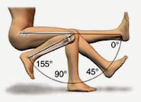 I found a diagram which perfectly demonstrates the limits with which an elbow joint can operate. Using it as a guideline, I designed the upper and lower arm to fit together when fully extended, and made the elbow joint long enough so that flexion and extension could occur without any overlap.
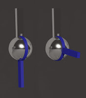 I decided that the easiest way to do this was to use a sphere as the ball of the elbow, ankle and knee. I actually made one mechanism and re-scaled it for multiple purposes.
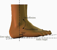
Using my newly acquired knowledge I made a joint which allowed for an extension of 180°, an angle which would satisfy the 140° required for the elbow, 155° for the knee and 90° for the ankle.
EYES
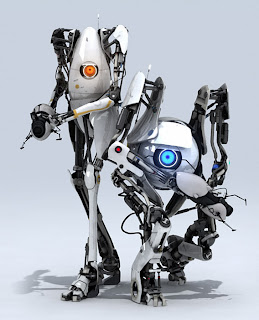 The concept of an 'eye-bot' as such has been done before on a number of occasions. In the Fallout game franchise, there are robots known as Eye-Bots that acts as camera drones and are floating spheres or 'eyes'. In Portal 2, two notable 'eye-bots' (shown left) are featured in the game's co-op mode. These characters are known as Atlas (right) and P-Body (left). These characters bear similarities to mine, in that they feature eyes in the centre of their head, and have both arms and legs.
While these characters definitely played a part in the design of my characters, I did not use them as a reference point. I think subconsciously I had these characters in the back of my mind, and they did serve to point me in a direction of how I would progress my characters, perhaps even the concept of a humanoid eye-bot.
STAR WARS
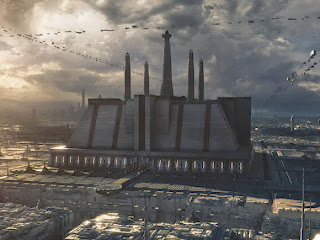 The concept of a factory scene is rooted solely in this image (right). It is an image of the Jedi Temple on Coruscant. This image is from the Star Wars universe. As a huge fan I was looking to implement Star Wars in my project somewhere, this building sparked an idea for a factory design with which the animation would take place. It was intended that I would model a city-scape similar to this and implement an exit scene, but due to time constraints the idea was scrapped.
 |
| Droid Factory on Geonosis |
ESCAPE
The concept of an escape stems from my experience with the Playstation game Abe's Odyssey. In this game, the protagonist (Abe) seeks to purge his fellow workers from an overlord who aims to enslave Abe's friends and eventually species. The game (initially) takes place in a factory and is centred around the rescue of Abe's friends. I have taken elements from both the plot and environment of this game and implemented them in to my animation. Bub takes on the role of Abe as the one who can see the problem and acts as the catalyst to an escape.
Note: Coincidentally, I found out while researching that the sequel to this game is titled 'Abe's Exoddus'.
AWAKENING
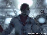 The opening gameplay scene in Fallout 3 involves opening the players eyes as a newborn baby. In this scene, a heartbeat is played loudly and to great dramatic effect. Although the scene itself is not overly complex, the sound effects and blurred camera made for an effective and convincing scene. I tried to imitate this effect in my animation, using the dark container as a go-to for an awakening.
 Thursday, 31 October 2013
Eye Balls
After watching a YouTube tutorial (at: http://www.youtube.com/watch?v=zT-fQqLqxII) on how to create a photo realistic eye in 3DS Max, I am convinced that I have a solid project ahead of me.
Above is a screen-cap of the beginning of my production. On the left there are two sliders labelled DILATE (SMALL) & DILATE (LARGE). These sliders are connected to the eye situated next to them. The function of these sliders is to (manually) control the dilation of the pupil of the eye. To achieve this I made two copies of the original eye, modified to the vertices on one to be smaller, and the other to be larger. I then applied the Morpher modifier to the original, and allocated the replicas as targets for the morph. The use of sliders is purely for convenience.
Mapping the eye was no simple task. To begin with, I modeled a hemisphere. Then organised the top vertices accordingly to the proportions I wanted my eye to be. During this process, I was also working on an image for the map of my eye.
The image above is a comparison between an image found on Google, and the image I used as the map for my eyes. The image on the left is the original, and (after some work on Photoshop) the image on the right is the completed version.
To make this eye I cloned the left side and flipped it over to the right as the left side was not affected by reflections. After that, I touched it up using the eraser and clone stamp tool to remove the symmetry and make an improvised, completed version of an eye. Finally I sacrificed some edges and cut out a circle, using the centre of the pupil as my reference point.
The above image is the UV Map from my eye model, this was used to align the dimensions of my eye map to the model, so that it would be positioned correctly in 3DS Max.
These are the maps used for the final product, the red has been reduced as I felt it's intensity looked too artificial. These were achieved simply with colour layers applied over the original image in Photoshop.
This video is the first (in a long line) of videos that I have rendered, it demonstrates the dilation of the pupil through all it's stages. Starting large, it goes to small, then standard size. I plan on manually adjusting the pupils based on light exposure.
The above video demonstrates the eye rig connected to a dummy via a 'look-at' constraint, as well as more dilations. The map for the eye is outdated and the current ratios make it a lot smaller and more realistic.
The Boys
I decided to use three characters as protagonist figures for my animation. For design purposes they are named: Bub, Legs & Float.
Bub
In addition to having four limbs, Bub is also not a traditional sphere. He was created using a sphere, but modified using soft selection and simple skewing of polygons to create his unique shape.
Bub's arms, legs and feet are cylinders which have been modified using the manual realignment of both vertices and polygons. The glowing wires used as shoulder tendons are 2D lines, which have been modified with the 'noise modifier', and finally converted to an edible mesh, so that the material could be added to a 3D model to achieve the full effect.
Bub's hands are composed of boxes and spheres. A box was used to form the basis of the hand, then a smoothing modifier was applied. His fingers are spheres which have been heavily skewed, almost into tube shapes. This allowed for pointed fingertips that were seamless.
The final version of Bub is shown above, rigged to a biped.
Legs
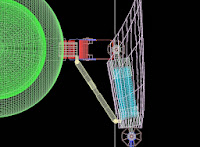
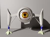 The design of legs was intended for the composition of a trio of protagonists which compliment each other. His legs were originally designed to contain springs (right) that allowed him to elevate himself up where others could not access, or extend to such a length that only he could reach. I decided that such an inclusion would be more trouble than it was worth, and scrapped the idea due to time constraints.
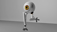 With the inclusion of a running scene, and after many (failed) attempts at creating a walk cycle for this character; I decided that an alternate form would be the most appropriate to create a walking or running scene including this character.
 This alternate form featured spheres serving as sockets for the legs to be attached (similar to Bub's leg design) which allowed for 360° rotation. Because of this added dimension, Legs is able to transform from a lower, more stationary form, to an agile and athletic form. I did not have time fiddle around with the transition process, and so worked it in to my animation without the actual process being shown. Springs coiled several thousand times each are used as ligaments to connect Legs' thighs to his lower legs. This allows for evidence of realism as it provides support to Legs as he runs, and generally looks cool.
Float
At first I wanted to have the ring transform into Float's body. Plates on his exterior would shift open allowing for the ring to collapse into him. Again, I was constrained by time and had to settle with a simple vanish inside the body.
This was achieved by creating two identical rings, applying an 'edit poly' modifier to both, selecting all the polygons of one and shrinking them to a size which would fit inside Float. I then applied a Morpher modifier to the original, and made the second state to be the shrunk version. Once this was completed I rigged the sequence to a slider for ease of access, and animated it as was needed.
These characters are all coloured white, this is used to create the atmosphere of a faction or light vs dark, even good vs evil. The next character is named 'Igor', a name I felt was appropriate for the caliber of this character.
Igor
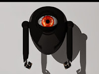 For all intentions, the Igor model was designed to be a bad guy. I had planned to incorporate an inhibitor which caused the Igors to turn from white to black and obey some higher power. That idea was too complex, and scrapped.
 Igor's body was made similar to Bub's, but with more emphasis on the top. I wanted Igor to look like a big, hulky grunt with a lot of intimidation but not much actual ability. This explains the simplicity of his design.
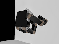 His arms are cylinders connected to spheres, his hands are the most complex aspect of his design. Igor's hand actually forms the basis of Bub's hand, without the smooth modifier. I created each finger individually using a combination of boxes and a pre-designed piece from the 'damper' model in 3DS Max to make the knuckles. Initially I had the fingers rigged an IK constraint each and managed to get them working independently of one another, that became a problem when I worked with the hand as a whole. The whole hand was grouped together in several fixed positions and used for animation.
 Contre Joure
I had three scenes in mind when plotting the course for my animation. The title of the animation 'Exodus' refers to the act or an instance of going out, and so the underlying objective of my animation was to detail an escape. I also think 'Exodus' sounds cool.
Scene 1 - The Cargo Bay
This scene is is where part 1(of 3) takes place. The design of it is fairly straightforward, a box as the set, and a plane for the floor. To begin with I designed the... machine which can be seen as a series of cylinders and boxes in the middle of the room. This machine was originally planned to convert white robots into black ones through means of an energy source. While this situation is still present in my animation, it is far from what I had originally planned, but the meaning is nonetheless portrayed.
Below the machine is a glowing, white conveyor belt. This belt was (at first) a functioning conveyor belt. I created it one night while following a YouTube clip on how to make it, this method (while looking good) was both time and resource consuming, so I decided to go with the Sci-Fi glowing one instead.
In the scene contain a series of shipping containers. These were an essential part of my scene, and were not modeled by me. They can be found here: http://tf3dm.com/3d-model/shipping-container-36873.html. This model saved me a lot of time as I incorporated it late in to the year. I have not contacted the creator but my gratitude is with them as I could not have completed this scene without it.
Scene 2 - The Citadel
This scene is my pride and glory, and was the first to be completed. To begin with, I modeled the walls using the edit poly modifier on a box. I adjusted the sections to allow for a 45x50 cube, then selected all the faces, and chamfered the edges, creating the in-seam. From there, I extruded these newly created faces inwards and applied a glowing red material to them. By contrast this created the effect of plating for the remaining faces. Depending on the angle, the glow of the walls change, this can be seen in the image above where only the horizontal lines on the left are visible.
The mesh tunnel was created using a series of cylinders placed appropriately around an arch. To create the arch itself I lofted a circle around a semi-circle and extruded the bottom face of each circle to make the respective poles. After completing a segment I simply cloned and repeated. Unfortunately I forgot to reduce the polygon count of each cylinder resulting in massive resource dedication. I did not learn of the technique of 'optimization' until post production, a lesson learned.
The lights used in this scene are simple spot lights, with a Photometric Omni Light in each lamp to give the impression of real light bulb. Spot lights were the only light I could find that wouldn't emit light through the lamp. It was not until post production that I discovered the Mental Ray Shadow Map and applied to lights in other scenes, that I realized I had over-complicated my lighting. Nevertheless, the desired effect was still achieve and the lights acted like I wanted them to. I made this scene without floors for two reasons; one reason was because I couldn't fix the clipping of the spot lights through the platform (light can be seen on the wall through the far end of the platform). The other reason was because I wanted to create the atmosphere of a large complex, rather than a small scene, and I thought a vast drop would help achieve that, or at least take away any inclination of height.
Scene 3 - Processing
I designed this scene with a factory complex in mind. I wanted it to look as simple as possible, just an aspect of a factory necessary for it's functioning, and I think I achieved that. This scene depicts a processing facility, with bins taking materials in and out.
I left the gateways (if you like) white because I wanted to leave the audience hanging about what it what lied behind the white walls of light. Keeping in mind that this project is a cinematic trailer, an ambiguous ending was the only appropriate way to conclude.
The large structures making up the walls are gigantic boxes. The middle has been booleaned to allow for the holes in the gateways. The duct with which the characters fall out of was made using a a series of boxes all bridged together as a single editable poly.
All of the trolleys were rigged onto a path constraint, which followed two paths; one heading towards the light and one away from it. The bins for the trolleys were not modeled by me and can be found here: http://tf3dm.com/3d-model/dumpster-85269.html. Due to time constraints I sought out a model with high amounts of detail and stumbled upon this model. The trolleys themselves are my creation, but could not have been possible without the bins.
Magic
This post is dedicated to the various techniques I adopted to achieve certain effects in my animation. These effects will appear in chronological order.
Eyelid
To make this effect I booleaned a sphere with a slightly smaller one. I then went back in the boolean operation and sequentially modified the 'slice on' parameters for the sphere, resulting the effects of an opening and closing eyelid. I applied a material which allowed for no light reflection & refraction, and sat a camera fixed in the centre of the 'eye'.
I then got a rigged model of Bub, deleted his torso and eye, and rigged my newly created 'eye' to the biped. This allowed for the appearance of the arm, and gave the impression of looking through an eye.
Decimation
This scene was a last-minute improvisation as I realised I did not have the resources required to do what I had originally intended to do. I had planned to have some kind of pushing on Bub's part which would knock over the Igors and end their bullying of Float, but as my animation skills are lacking and I could not make a convincing throwing animation or a pushing animation, I resorted to another technique.
I had previously purchased an educational licence of RayFire (http://rayfirestudios.com/). This is an add-on for 3DS Max's MassFX simluator, and allows for the realistic fragmentation of objects. I simply applied a fragmentation to the Igors, and converted Bub's foot into a kinematic object, so that it would interact with the newly fragmented Igors. MassFX then simulates the flight pattern of the fragments, resulting in realistic destruction.
Renovation
This effect is grounded in the RayFire implementation. The subject wall was fragmented into almost 4,000 pieces, each containing between 5 and 20 faces. This was easily the most time-consuming aspect of my project as even moving the camera would result in lag and sometimes crashes. However, the work paid off as I believe that this is the most visually appealing moment in the animation.
Similar to Decimation, I set up Bub's whole boy as a kinematic object which would impact the wall, this allowed for pinpoint accuracy when the wall was breaking. I placed a Photometric Omni right next to the door to give the effect of flooding light entering the hole in the wall. I think this made the scene as it put emphasis on the entrance of the characters.
Following the wall break, I converted both Bub and Legs to Dynamic Objects, this allowed them to literally fall to the ground as they fall into the duct upon the floor hatch opening.
Transportation
To create the bouncing effect of the components down the duct, I implemented techniques of the MassFX engine in 3DS Max. This provided an environment in which gravity affected objects of my choosing. To make the scene I created a network of boxes around the duct, and made them invisible to the MentalRay Renderer. I then applied a RigidBody modifier to the respective components of Bub and Legs, and converted them to a rubber material, so that they would bounce as I needed them to.
I also converted the trolley into a RigidBody and made it metal, so that the components would physically land inside it. After many hours of toying, I finally made it work to the desired effect and result.
Subscribe to:
Comments (Atom)


